ful
Package Design ; Brand Identity ; 2021
about the project
I’ve always loved rice. It’s a staple in Asian culture, but I’ve always found it annoying to buy the big heavy bags of rice and trying to haul that home or the small plastic packs that spill easily. Most of the time when I’m going out to buy small packs of rice, I found that most of the packages were designed to almost make it seem like rice
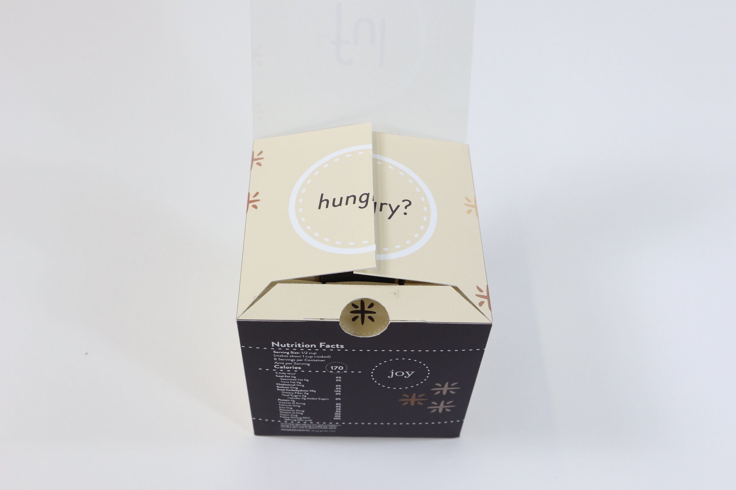
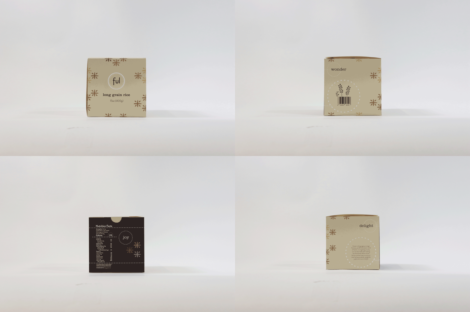
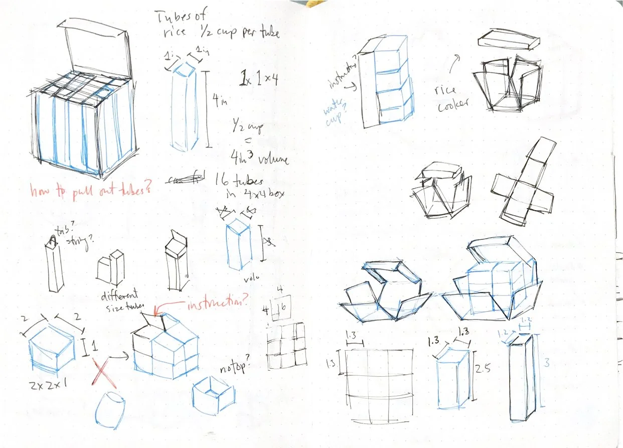
Introducing ful, a 4x4 cube rice packaging aimed towards people like me: single-living, broke college students who don’t want to buy gigantic family-size rice bags and would prefer a more sustainable option. The design of ful also aims to solve the problem of portion control and time spent measuring servings by dividing the rice into eight tubes, each containing one serving (half cup). The center includes a small instruction manual for beginners, but it also exists to make pulling out the tubes much easier (because if the box has 9 tubes it would be very difficult to pull one out without breaking the box or spilling something).
tools
Adobe Illustrator
The decorative patterns are made out of rice grains to form the Chinese character for rice (米), since the rice I’m using is imported from China. I used the dashed lines as abstracted rice grains as well and to also serve as an editorial element. Visually I wanted the box to have a comforting and fulfilling look, the same feeling that I get whenever I eat rice.


